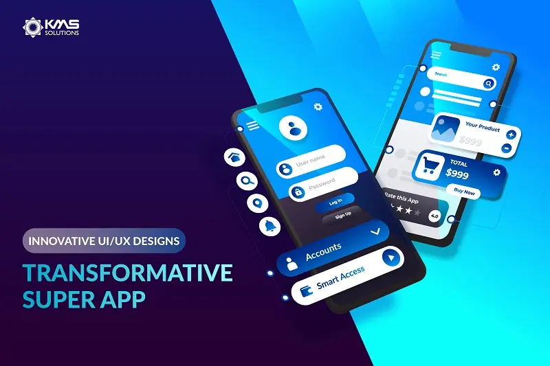
As app fatigue sets in, super apps start to rise and gradually take over the market due to their simplicity, utility, and convenience. By offering the benefit of a one-stop platform, super apps deliver seamless experiences that keep consumers engaged while saving them the hassle of downloading and managing multiple individual apps.
Considering the broad adoption of super apps, numerous companies are on their way to investing and taking part in this technological movement. One of the most significant challenges is how to design user-friendly and engaging super apps that win customers’ hearts. This article will walk you through the process of a super app UI/UX design.
Trend app features to base your UI design on
Rather than designing an app as a whole, starting with specific features that you’re attempting to build is advisable. This helps to narrow down your focus. For a great UI design, you should be aware of current and upcoming mobile app trends to keep up with the latest development in the market. Following are three popular trends in super apps that you can base your super app UI design on:
- Buy Now Pay Later (BNPL)
- eKYC verification
- Personalization
- Payment Gateway
- API Integration
How to innovate your super app using current mobile app trends
Here’s how you can incorporate these above-mentioned mobile apps trends into your mobile banking app to make it stand out from rivals.
1. Streamline customer verification
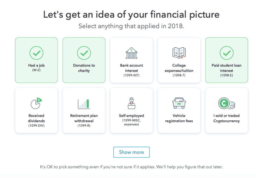
Since more and more app providers implement eKYC for their products, your super app might be at considerable risk if it doesn’t offer this convenient and effortless option. Long gone are the days when users had to type in the password manually; now, instant access with a high level of security is expected.
To maximize security, KMS Solutions’ banking super app sign-up section is integrated with an eKYC solution that employs multi-factor authentication, including ID capture, liveness detection, face matching, phone number verification, etc. Sign-up screens are suggested to be minimalist and direct so that clients can effortlessly access the super apps. Explicit instruction is provided in every step of the onboarding process, guiding users through the process quickly. The copy should be short and informative
2. Have data at the user’s fingertips
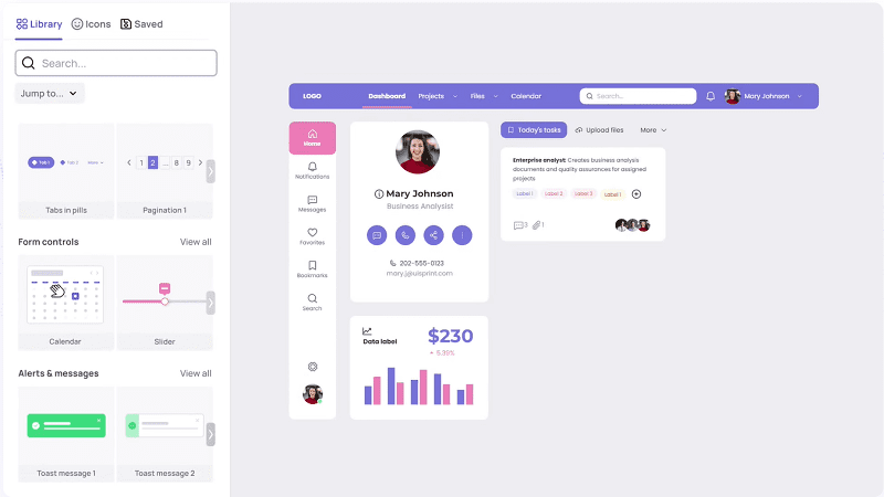
The financial status overview is a fundamental feature of every super app. It’s where users can monitor personal finance situations to better manage and plan financial activities. While consumers want to view their balance account, merchants track their revenue, transaction history, and sales channels.
For the banking dashboard, KMS Solutions aims for a user-friendly and simple app design concept. It demonstrates not only the seller’s overall revenue but also displays details of transactions (the amount, channel, location, beneficiary, category) and recent financial notifications.
Our objective is to highlight vital information while maintaining a low graphic density to promote readability and usability. Graphs, scales, and icons can help the stats screen look sleek and organized.
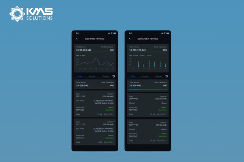
Moreover, it’s vital to consider a scenario in which the consumer possesses various accounts and wants to view the status of each account. In this case, your design can have an additional option that allows users to instantly change between the accounts with a simple swipe.
3. Jumping on the BNPL trend
Driven by innovations in credit access and purchase flexibility, the number of BNPL users is increasing rapidly with it being most popular among Gen Z and Millennials. Thus, your supper app can’t miss out on this new payment trend to attract young consumers.
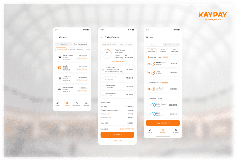
Payment gateway APIs like PayPal or Stripe allow you to integrate a payment solution with your product’s checkout function and process credit card, bank and installment payments.
Let’s take a look at the typical e-commerce platform Kaypay’s design of installment payments. With its clean and simple design, users can easily view their BNPL orders and track their status. In each order, clients will be able to view the installment payments with clearly illustrated due dates and transaction amount.
4. Create personalized offers that solve customer’s pain point
Super app provides a wide range of services. Yet, many consumers are still unable to exploit the full potential of these products. It is understandable as too many offerings can result in hesitation and uncertainty. Individuals might find difficulties understanding the benefits of all products and how to use them properly.
However, this problem can be somewhat alleviated when the user experience is entirely customizable and capable of developing recommendations tailored to each customer’s unique demands in particular situations using AI and Big Data.
This can be achieved by incorporating your system with customer data platforms like GoodData and Infor Birst using API integration. Such platforms will enable you to track and assess users’ buying patterns, purchasing habits, financial statements, demographic data, and contextual analysis. Recommendations can be:
- Alerts of high-priority financial activities which demand instant attention
- Notifications of monthly payments
- Provide users with a travel insurance option when they buy a flight ticket
- Notifications about new sales promotions of user’s favorite stores
- Assist in finding nearest ATM using location-based push notifications
Key steps for creating super app UX/UI design
The main phases in the super app UI/UX design process comprise:
- Determining the primary user scenarios
- Examining and selecting essential app features
- Establishing information architecture
- Delving into cutting-edge technologies for a frictionless digital customer journey
- Making an aesthetically pleasing design
During the design stage, those are a few factors that you should consider:
User Flow Diagram

The starting point for creating a super app will be a user flow diagram. This will help you to visualize the full sequence of steps a user would undertake when utilizing your app. You should strive to design a straightforward pathing that is easy to navigate and quickly accesses different app modules.
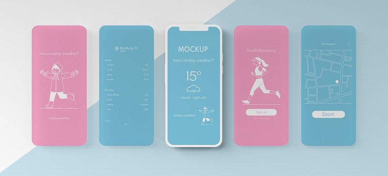
Low-fi Wireframes
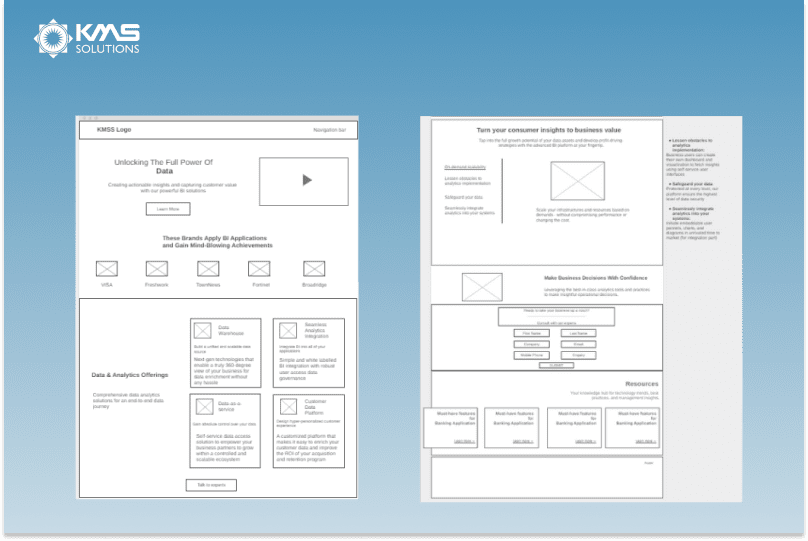
Low-fi wireframes serve as the initial blueprint for the super app interfaces. Each frame includes fundamental design components, comprising image placeholders, shapes, and texts to map out the product’s skeleton, basic architecture and features. They assist project teams in visualizing and testing early concepts as well as design assumptions.
Hi-fi Wireframes
Hi-fi wireframe is an advanced version of a low-fi wireframe with more precise aesthetic and content. Many are clickable and responsive to user actions. Visily is a great design tool for this. This AI-powered design software can help you design hi-fi mockups swiftly with automatic theme generation, rich component library, and an intuitive drag-and-drop interface.
Color Palette
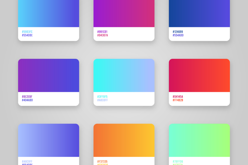
Selecting a color palette is a crucial element of the design process. Criteria to consider for a great color scheme are:
- Product identity: A product identity represents your brand’s values and the way it communicates with buyers. Hence, before selecting the color palette, you must define how you want the end user to view your product.
- Emotions: Colors elicit feelings. While it can be difficult to pinpoint exactly what your color scheme means as each individual has different color interpretations, there are certain fundamental principles to bear in mind. For instance, brighter colors are often deployed by playful, energetic brands that target young audiences. Meanwhile, businesses aiming for a mature, professional image will use more muted colors.
- Audience: Poor color choice can negatively impact customers’ perception of your product messaging. Keep in mind who you are designing for and what is the ultimate purpose of creating colors that appeal to your target audience.
- Contrasting: To draw attention, you must contemplate how well the text color contrasts with the background color. This also makes the paragraphs more aesthetically pleasing, making it easier for viewers to read and comprehend the information swifter.
- Complementary: to ensure your colors look good together, you can refer to a color wheel for complementary colors or free color palettes generator for trial and error
Typography
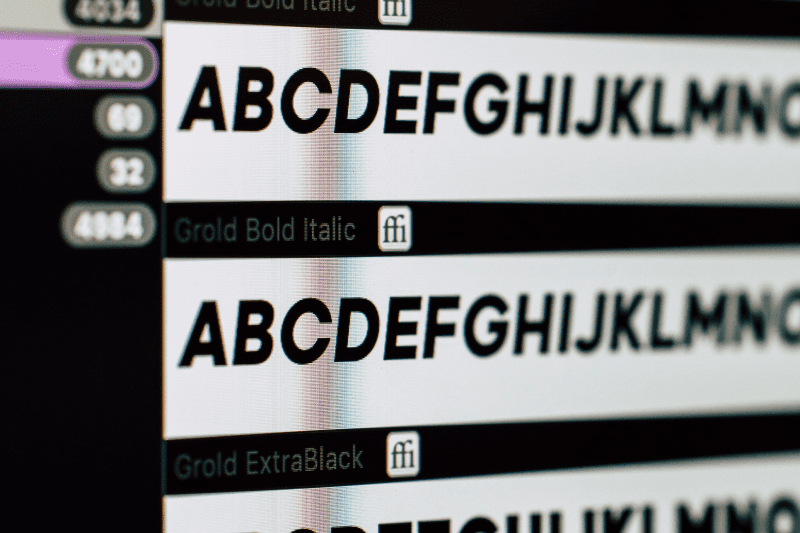
A good UI typeface can help increase your super app’s usability, readability, and accessibility. Following are eight elements of typography to ensure your viewers have a pleasing experience
- Font/Typeface
The scalability of a typeface is a necessary factor of typography. It is expected to be readable on every mobile phone screen size.
The safest approach is to limit your fonts to only two or three typefaces. Using three or more different fonts might result in a cohesive look. The minimum font size for mobile apps is at 16 pixels.
- Leading/Line Height
Leading or line height is the space between lines of text. It becomes challenging for the visitors to read and follow lines of texts when there is no space between them. In contrast, excessive white space can make reading large text sections tiring.
The standard leading in mobile app design is 120% of the font’s point size. This percentage can differ slightly depending on the chosen font and its x-heights, ascenders, and descenders.
- Kerning
Kerning is the process of modifying the space between characters to create a more pleasing pairing by balancing the whitespace between letters. This is critical in headers and large types. Though kerning is less crucial in paragraphs of small type, it can be helpful when aiming to prevent line breaks in the design.
- Hierarchy
Besides size, hierarchy also centers around the prominence of your typographic components concerning one another. This could be accomplished using a different font, a contrasting color, and white space.
One way to establish an effective hierarchy is to sketch out your visual element in order of importance, from the most significant to the least important. Ask yourself which competent of the design you want the audience to pay attention to first.
- Tracking/Letter spacing
Tracking is the spacing between the letters of a word. Having your letters too close together can create visual density and make your content difficult to read. Whitespace can be applied to generate balance and add a level of communication to a typography treatment.
Motion prototype
To evaluate real-life user experience, you might want to develop a motion prototype. Based on the design concept, the prototype enables you to test user flow and optimize it.
Function like a real app, the motion prototype opens up many possibilities:
- Investigate the product’s usability and customer reaction before starting the coding
- Impress stakeholders/investors by offering intriguing real-life touch and interaction experience of the solution
- Establishing final product interplay and motion attributes to the development team
Mistakes to avoid in super app UI/UX design
One of the significant reasons behind super app failure is poor user experience. As customer’s needs and pain points evolve, you’ll need to continuously improve the UX you offer to deliver the greatest possible products. Here are a few common UI/UX mistakes that irritate users.
1. Complex navigation
A solid UI design should flow without difficulty. Clients should be able to navigate back and forth the super app effortlessly and intuitively. A cluttered interface can lead to decision-making paralysis and increase customer churn. Hence, using too much flyout and drop-down submenus are not advised. Unfortunately, this can be a challenge when super apps are meant to contain multiple features and services.
A good way to avoid overloaded interfaces is to personalize user onboarding. For example, first time users can be prompted to segment themselves by use case. The app then only illustrates appropriate features, creating a seamless user experience and simplifying the UI.
2. Too many notifications and pop ups
Nothing drives users away more than being bombarded with a variety of different pop-ups as soon as they enter your app. Instead of getting the information they seek, consumers have to battle with closing a plethora of pop-up windows even before interacting with the super app.
Not all pop-ups are unpleasant, yet be aware of ones that are improperly situated and poorly constructed. Contemplate how many you want to employ and when. UX-friendly pop-ups should be able to close easily and don’t disrupt the user experience by taking up the whole screen.
3. Imbalance between aesthetic and functionality
Your super apps should strike a perfect blend between creativity and usability. Many companies make mistakes focusing solely on looks but not functions which can result in low conversions and customer dissatisfaction.
Following are the common functionality errors frequently done for the sake of aesthetics:
- Slow app loading time
- ‘’zig-zag’’ forms or incorrectly configured validation
- Too many custom, unfamiliar icons
- Confusing buttons
- Tiny clickable areas
- Scroll hijacking
4. Fail to understand your users’ needs
To develop a good UX design, UI/UX research and testing are vital since it points out user requirements and entitles you to validate whether your solutions are truly beneficial.
Every designer should consider both their conceptual model and the user’s mental model while creating the super apps. It is also suggested to be proactive in gathering customer feedback throughout the lifecycle of your product. This empowers you to establish a recurrent cycle of user listening and product optimization.
Conclusion
Today, UI/UX design has become an integral part of super apps. Without an intuitive and functional user interface, your super apps can never attract and engage people. Conduct frequent testing across various stages, pay attention to trends, and tweak the design to keep it enjoyable for clients.
We at KMS Solutions are passionate about helping enterprises develop transformative and innovative applications. In case you need expert perspectives on your super app design, KMS Solutions is ready to assist.